
Earthy & Elegant: How to Decorate with Warm Greige, Taupe, and Clay

There is a particular kind of beauty that doesn’t demand attention. It reveals itself slowly—in the soft variation of a limewashed wall, the imperfect edge of a handmade bowl, or the way afternoon light warms a taupe linen curtain. This is the essence of an earthy, elegant interior: understated, tactile, and deeply connected to the natural world.
Warm greige, taupe, and clay are ideal colors for creating this atmosphere. Together, they form a sophisticated palette that feels serene without becoming cold, neutral without looking bland, and timeless without being predictable.
I have always been drawn to rooms that feel collected rather than decorated. In my favorite interiors, every material seems to have a quiet purpose. Wood brings warmth, stone adds permanence, linen softens the light, and clay introduces an unmistakably human touch. The colors work in much the same way. Warm greige creates a calm foundation, taupe brings depth, and clay adds an earthy pulse.
In this guide, I’ll show you how to use these nuanced shades throughout your home—and how to combine them with texture, light, furniture, and natural materials to create an interior that feels both grounded and refined.
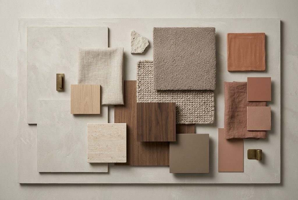
Understanding the Palette
Before decorating with warm neutrals, it helps to understand what makes each shade distinctive. Greige, taupe, and clay may all belong to an earthy family, but they play very different roles in a room.
Warm Greige: The Quiet Foundation
Greige sits between gray and beige. While cooler versions can look silvery or slightly blue, warm greige contains beige, brown, or subtle yellow undertones.
It is one of the most versatile colors you can use in an interior. Warm greige adapts beautifully to changing light and creates a softer alternative to stark white. It can make a room feel fresh and spacious while still providing enough warmth to feel welcoming.
- I especially love warm greige on:
- Walls and ceilings
- Large upholstered pieces
- Curtains and Roman shades
- Rugs
- Kitchen cabinetry
- Built-in storage
- Natural plaster or limewash finishes
Think of warm greige as the canvas of the room. It establishes calmness without dictating a particular style.
Taupe: The Sophisticated Middle Ground
Taupe is richer and more complex. It lives somewhere between brown, gray, and beige, often with subtle pink, violet, or mushroom undertones.
Where greige tends to recede, taupe gives a room visual weight. It is elegant but not formal, cozy but not heavy. Depending on its depth, taupe can function as either a neutral background or a soft accent.
Use taupe for:
- Sofas and armchairs
- Bedroom walls
- Rugs and runners
- Wooden furniture with gray-brown finishes
- Upholstered headboards
- Cabinetry
- Decorative cushions and throws
Taupe is particularly effective when you want contrast but find black or dark brown too strong.
Clay: The Earthy Accent
Clay encompasses a wide range of colors, from soft terracotta and dusty rose-brown to muted rust, cinnamon, adobe, and sunbaked orange.
It is the warmest and most expressive part of this palette. Clay adds life to restrained neutral rooms, but it still feels organic because it comes directly from the visual language of earth and minerals.
Clay works beautifully in:
- Ceramics
- Accent walls
- Cushions and blankets
- Artwork
- Tiles
- Lamps and sculptural objects
- Small pieces of furniture
- Bed linen
- Planters
The key is to choose softened, mineral-inspired clay tones rather than bright orange. A good clay color should feel as if it has been faded by sunlight and weather.
Why These Colors Work So Well Together
Warm greige, taupe, and clay create a naturally balanced palette because they share earthy undertones. Rather than competing, they build on one another.
Warm greige brings lightness. Taupe adds structure and depth. Clay supplies warmth and personality.
The result is a room that feels layered without relying on dramatic color contrasts. This makes the palette especially suitable for interiors intended to be calm, restorative, and long-lasting.
These colors also respond beautifully to natural light. On a bright morning, warm greige can feel fresh and airy. In the evening, it becomes softer and more intimate. Taupe reveals subtle brown or mushroom notes, while clay develops a rich, glowing quality.
In other words, this is not a static palette. It changes throughout the day—and that is part of its charm.
Begin with the Undertones
The greatest challenge when working with nuanced neutrals is matching their undertones.
A greige with a noticeable yellow base may clash with a taupe that leans strongly violet. A pink-toned clay can look disconnected from a greenish greige. None of these colors is necessarily wrong, but they may not belong in the same visual story.
Before committing, collect physical samples of every major color and material:
- Wall paint
- Flooring
- Upholstery
- Curtain fabric
- Cabinet finishes
- Stone
- Wood
- Rugs
- Tiles
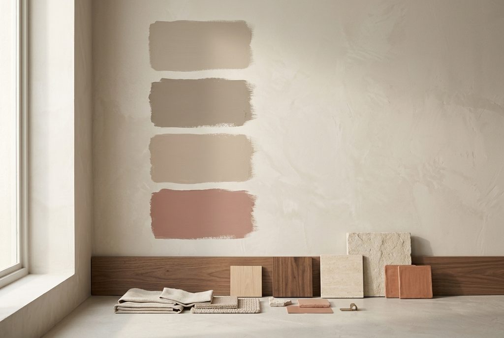
Place the samples together and observe them in the room at different times of day. Morning light, afternoon sun, and artificial lighting can make the same neutral look surprisingly different.
My personal rule is simple: never choose a complex neutral from a tiny digital image. Warm greige and taupe, in particular, need to be experienced in the actual space.
Paint large samples on several walls rather than testing one small patch. A color may look warm near a window and cooler in a shadowed corner. If possible, live with the samples for a few days before deciding.
Create a Clear Color Hierarchy
A successful neutral room still needs hierarchy. If every surface is the same shade, the interior can feel flat, even when the color itself is beautiful.
A helpful starting point is the 60–30–10 principle:
60% warm greige: walls, large rugs, curtains, or cabinetry
30% taupe: furniture, upholstery, wood tones, or architectural details
10% clay: ceramics, textiles, artwork, and carefully chosen accents
This is not a rigid formula. Some rooms may need more clay, while others benefit from a nearly monochromatic combination of greige and taupe. The purpose of the ratio is simply to establish a dominant color, a supporting color, and an accent.
For a subtle interior, choose shades with similar values. For more definition, combine a pale warm greige with deep taupe and medium clay.
Let Texture Do the Work
When a room has a restrained palette, texture becomes essential.
A warm neutral interior should invite touch. It needs variation between rough and smooth, matte and polished, dense and lightweight. Without those contrasts, greige and taupe can appear lifeless.
Some of my favorite materials for this palette include:
- Washed linen
- Bouclé
- Brushed cotton
- Wool
- Mohair
- Raw or lightly finished wood
- Travertine
- Limestone
- Tumbled marble
- Rattan
- Jute
- Hand-thrown ceramics
- Plaster
- Limewash
- Aged brass
- Woven leather
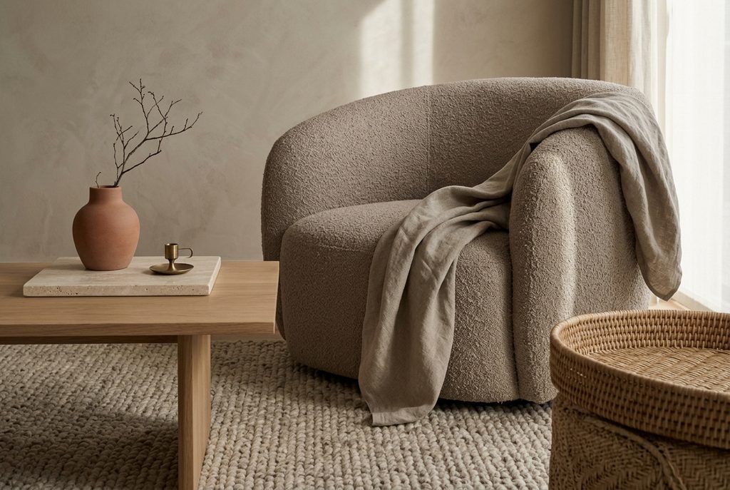
Imagine a warm greige plaster wall behind a taupe bouclé sofa. Add a weathered oak table, a clay-colored linen cushion, and a large ceramic vessel with an imperfect surface. The palette is quiet, but the range of textures creates richness.
I recommend using at least three noticeably different textures in every area of a room. A sofa, for example, might be styled with a smooth linen cushion, a nubby wool pillow, and a loosely woven throw. The colors can remain closely related because the surfaces provide contrast.
Choose Natural Materials Over Artificial Perfection
Earthy elegance is not about rustic excess, but it does depend on authenticity. Materials that age gracefully bring character to an otherwise minimal palette.
Wood is particularly important. Pale oak keeps the room airy, while walnut introduces sophistication and contrast. Reclaimed or weathered wood can add warmth, although it should be used sparingly if you want the interior to remain refined.
Stone works equally well. Travertine, limestone, and softly veined marble echo the mineral undertones of greige and taupe. Their irregularities make the room feel more natural.
Clay and ceramic pieces are the perfect finishing elements. Look for vessels with visible tool marks, tonal glazes, or slightly asymmetrical forms. I prefer one substantial handmade object to a collection of small, generic accessories.
A little imperfection gives a calm room its soul.
Decorating the Living Room
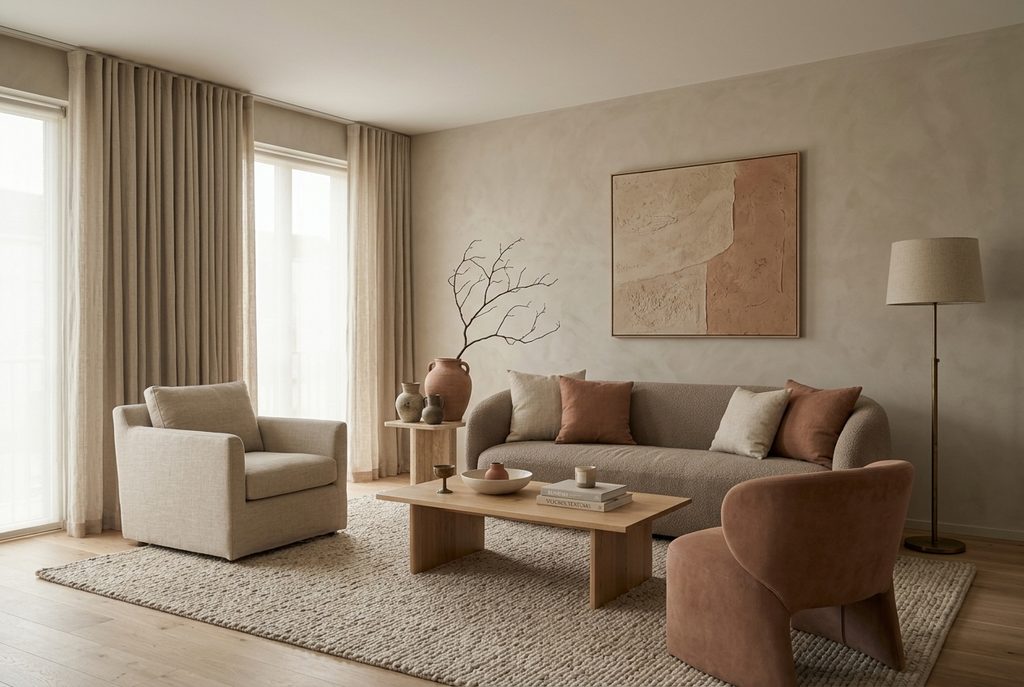
The living room is an ideal place to explore this palette because it contains so many opportunities for layering.
Start with warm greige walls or a soft limewash finish. If the room receives limited daylight, avoid overly gray shades. Choose a color with enough beige or cream to maintain warmth.
A taupe sofa can become the visual anchor. Instead of matching armchairs, introduce variation with warm oatmeal, mushroom, or muted clay upholstery. This creates a collected appearance while preserving harmony.
For the rug, consider:
- A wool rug in warm greige
- A subtle taupe-and-ivory pattern
- A natural jute rug layered beneath a softer textile
- A faded vintage rug containing clay, beige, and brown
Then add clay in measured doses: a terracotta lamp, a rust-colored cushion, an abstract artwork, or a group of handmade vessels.
Black accents can be used, but I prefer them in narrow, precise lines—a metal picture frame, a slender lamp base, or the legs of a side table. Large areas of pure black may feel too severe against this soft palette.
Aged bronze or antiqued brass often provides a gentler alternative.
Creating a Restful Bedroom
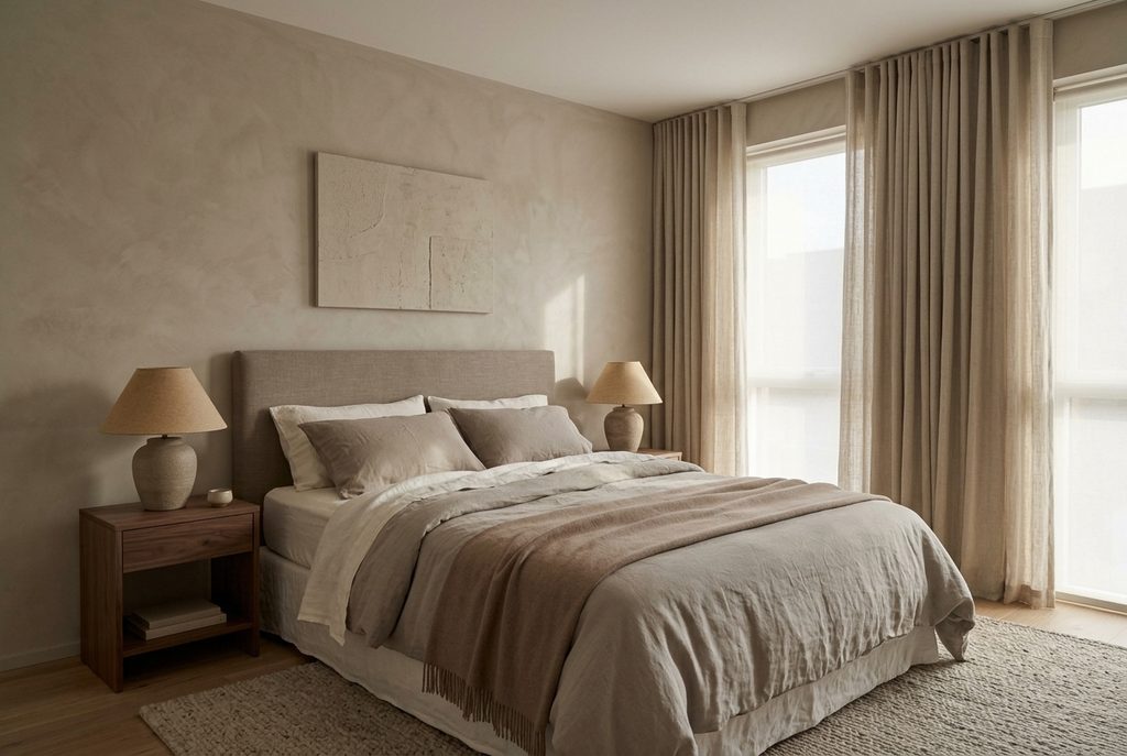
In the bedroom, taupe can take the leading role.
Taupe walls have a cocooning quality, especially when paired with tonal textiles. Choose a medium mushroom-taupe for intimacy, or a pale putty shade if you want a lighter feeling.
Layer the bed with:
- Warm white or oatmeal sheets
- A greige duvet cover
- Taupe linen pillowcases
- A muted clay throw
- One or two textured cushions
Try not to over-style the bed. Earthy elegance is most convincing when it feels relaxed. Slightly rumpled linen and generously layered natural fabrics often look more luxurious than a perfectly arranged collection of decorative pillows.
An upholstered headboard in taupe linen or wool adds softness. Complete the room with oak or walnut bedside tables and ceramic lamps with warm fabric shades.
For window treatments, hang full-length greige or oatmeal curtains. Their color should be close to the walls but not identical. This subtle variation creates depth while keeping the room peaceful.
Using the Palette in the Kitchen
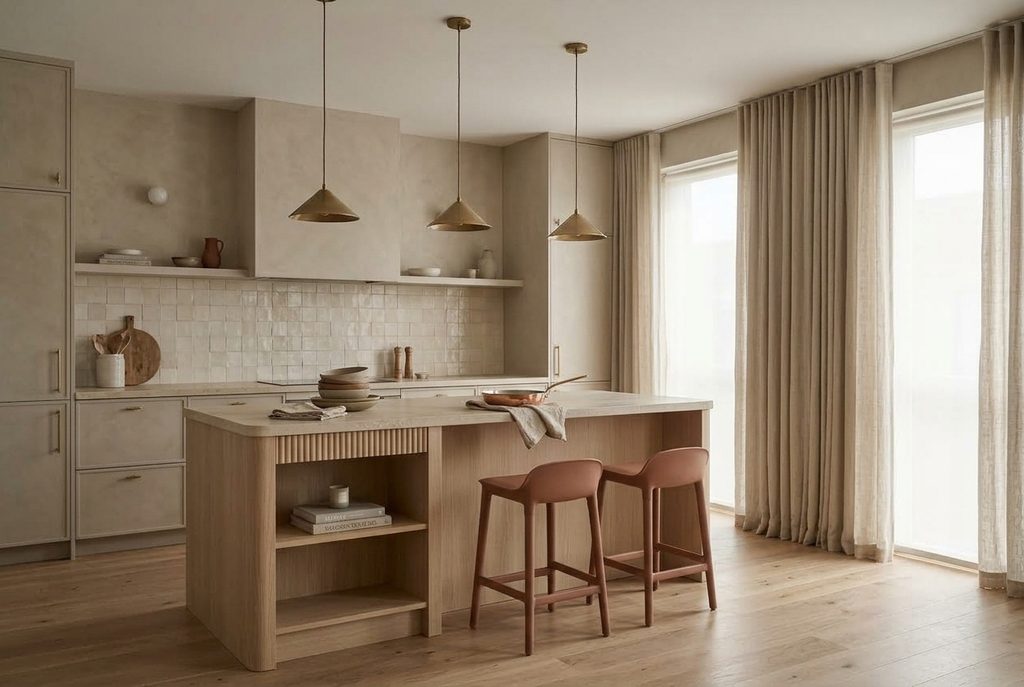
Warm neutrals can make a kitchen feel sophisticated without sacrificing comfort.
For cabinetry, consider warm greige, putty, or deep taupe instead of pure white. Pair it with a natural stone countertop that contains cream, beige, or soft brown veining.
Clay can appear through:
- Terracotta floor tiles
- Handmade backsplash tiles
- Ceramic tableware
- Rust-colored bar stools
- Copper cookware
- Earthenware serving bowls
If a full clay-colored backsplash feels too strong, use tiles with a warm ivory base and irregular clay edges or undertones.
Wood balances painted cabinetry beautifully. Pale oak creates a relaxed Scandinavian feeling, while walnut makes the kitchen richer and more elegant.
Hardware should support the warmth of the palette. Aged brass, bronze, and soft nickel generally work better than highly polished chrome.
Bringing Warmth to the Bathroom
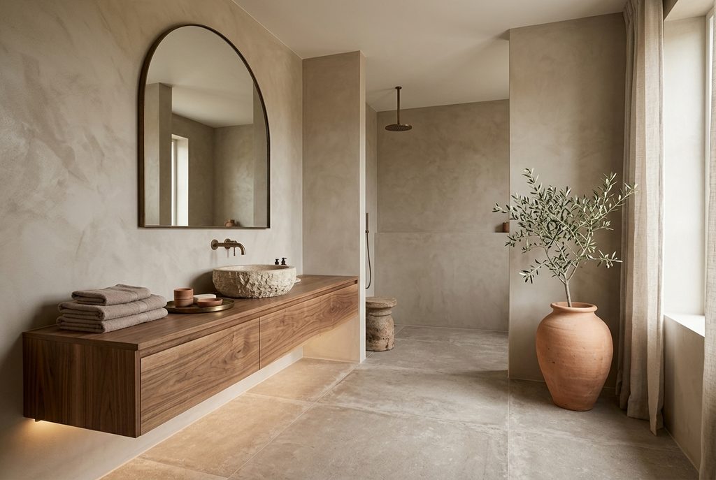
Bathrooms often rely on cold white and gray surfaces, but this palette offers a softer, more inviting alternative.
Use warm greige microcement, limestone, or matte porcelain tile as the foundation. Add a taupe vanity or natural wood cabinetry, then introduce clay through towels, vessels, artwork, or a handmade basin.
A clay-colored plaster wall can be especially beautiful in a powder room, where you can afford to make a more dramatic statement.
Pay attention to the color temperature of the lighting. Cool white bulbs can flatten earthy colors and make taupe appear dull. Warm, diffused lighting will bring out the richness of stone, wood, and clay.
How to Use Clay Without Overwhelming the Room
Clay is emotionally warm and visually distinctive, so a little can go a long way.
For beginners, I suggest introducing it through objects that are easy to change:
- A throw blanket
- Two or three cushions
- A ceramic lamp
- Framed artwork
- A vase
- Bed linen
- A tablecloth
Once you feel comfortable with the color, consider a larger gesture such as a clay-toned armchair, painted alcove, tiled backsplash, or accent wall.
To keep clay elegant, surround it with quieter materials. Against warm greige walls and taupe upholstery, clay feels refined. When combined with too many competing warm colors, patterns, and decorative objects, it can quickly become visually heavy.
Remember that clay does not have to mean orange. Explore subtle variations such as:
- Dusty terracotta
- Rose clay
- Adobe
- Cinnamon
- Muted brick
- Soft rust
- Burnt peach
- Earthy coral
Choose the version that complements your room’s light and existing materials.
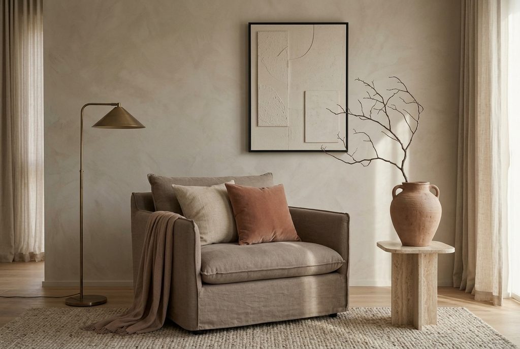
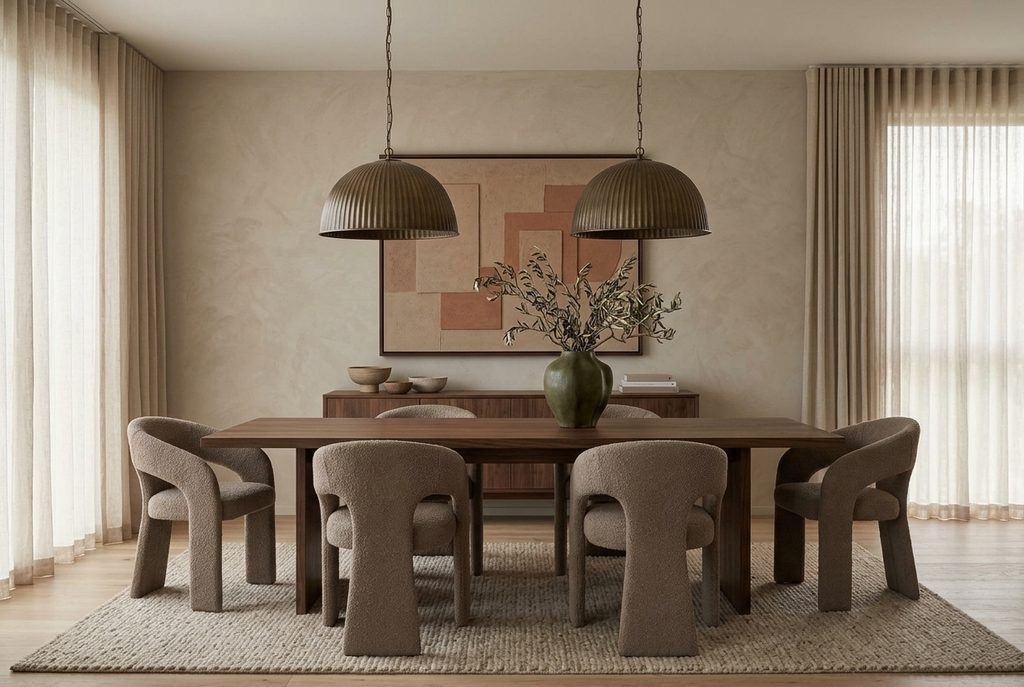
Add Contrast with Deeper Earth Tones
Even the softest interior needs a few deeper notes to feel grounded.
Instead of introducing sharp black, look to nature for darker colors:
- Espresso brown
- Charcoal taupe
- Burnt umber
- Deep olive
- Walnut
- Oxblood
- Bronze
- Dark terracotta
These shades can appear in furniture legs, frames, lamps, side tables, books, or small upholstered pieces.
Dark olive is particularly beautiful with warm greige and clay. It adds a botanical note without disrupting the earthy mood. Similarly, deep brown can define a room while feeling softer than black.
The goal is not dramatic contrast everywhere. A few well-placed dark elements will give the eye somewhere to rest.
Work with Warm White
White can still play an important role in this palette, but it should feel soft rather than clinical.
Look for warm whites with cream, ivory, or very subtle beige undertones. Use them for ceilings, trim, bedding, and selected ceramics.
Avoid brilliant blue-white finishes, especially next to clay or taupe. They can make the warmer colors look muddy and create an uncomfortable visual divide.
If your walls are warm greige, painting the ceiling in a related warm white will create gentle definition. For a more immersive effect, use the same greige on the walls, trim, and ceiling, adjusting the finish rather than the color.
Layer Patterns Carefully
An earthy palette does not require a pattern-free interior. In fact, subtle patterns can prevent neutral rooms from becoming too controlled.
Choose designs inspired by traditional crafts and natural forms:
- Fine stripes
- Small checks
- Faded geometrics
- Block prints
- Abstract botanical motifs
- Vintage-inspired rugs
- Tonal organic shapes
Keep the colors restrained. A taupe-and-ivory stripe or a muted clay block print will add movement without disturbing the room’s calmness.
I usually combine one structured pattern, such as a stripe or check, with one softer, more irregular motif. The rest of the textiles can remain solid and textured.
Style with Restraint
Earthy elegance depends as much on what you leave out as on what you include.
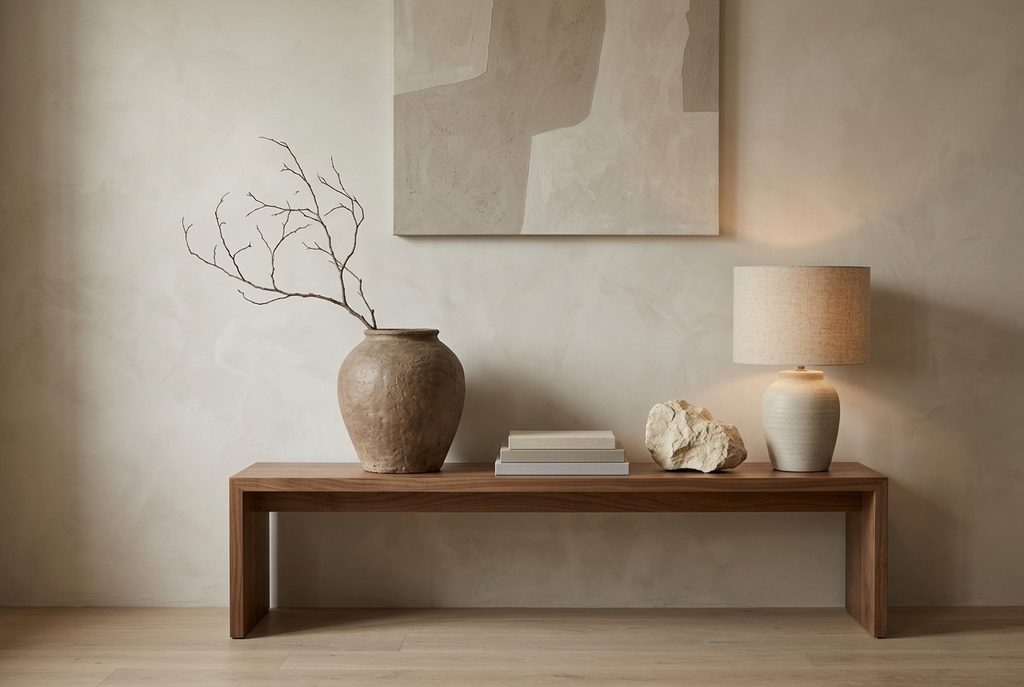
Rather than filling every surface, allow individual objects to breathe. Display a large ceramic bowl on a dining table, a sculptural lamp on a console, or a single branch in an oversized clay vessel.
Group objects in varied heights but similar tones. A stack of neutral books, a small stone sculpture, and an earthenware vessel can create a thoughtful composition without looking overly styled.
Avoid buying accessories simply to match the color palette. Meaningful objects, handmade pieces, and items collected over time bring more depth than perfectly coordinated décor.
A room should tell a story—not reveal a shopping list.
Common Mistakes to Avoid
Using Only One Shade
A room covered in a single greige can feel unfinished. Layer several related tones, from warm ivory to mushroom and deep taupe.
Ignoring Natural Light
The direction and intensity of light can change these colors dramatically. Always test finishes in the actual room.
Choosing Too Many Undertones
Try to maintain a consistent temperature. A strongly violet taupe may not sit comfortably beside yellow beige and orange terracotta.
Forgetting Contrast
Without darker elements, an all-neutral room can appear washed out. Add walnut, bronze, olive, or charcoal taupe for definition.
Relying on Color Alone
Texture is what makes an earthy neutral interior feel luxurious. Incorporate woven, brushed, raw, polished, and handcrafted surfaces.
Overusing Clay
Clay should bring warmth, not dominate every surface. Unless you are intentionally creating a dramatic tonal room, use it as a focused accent.
Making Everything Too Perfect
Matching furniture sets, identical finishes, and symmetrical accessories can make the room feel staged. Introduce subtle irregularity through handmade objects, vintage pieces, and natural materials.
A Simple Formula for an Earthy, Elegant Room
If you are unsure where to begin, use this approachable combination:
Paint the walls a light warm greige.
Choose one large taupe element, such as a sofa, bed, or rug.
Add natural wood in a pale oak, medium walnut, or weathered finish.
Introduce clay through three accents placed at different heights.
Layer linen, wool, bouclé, or woven cotton.
Add one darker grounding shade, such as bronze, espresso, or olive.
Finish with handmade ceramics and a restrained amount of greenery.
This formula can be adapted to almost any room and decorating style, from contemporary minimalism to relaxed Mediterranean or modern rustic interiors.
Final Thoughts
Warm greige, taupe, and clay have a quiet confidence. They do not depend on trends or dramatic visual effects. Instead, they create beauty through subtlety—through the relationship between light and shadow, roughness and softness, warmth and restraint.
To decorate successfully with this palette, think beyond paint colors. Consider how the room feels underfoot, how the curtains filter the morning light, and how the surface of a ceramic vessel changes when you hold it. Earthy elegance is sensory. It is created through materials, proportions, and objects that become more beautiful with time.
Most importantly, allow the interior to evolve. Begin with a calm greige foundation, layer in taupe for depth, and use clay wherever the room needs warmth. Add objects gradually, choosing pieces that feel personal and enduring.
The most elegant home is not necessarily the most polished one. It is the home that feels natural, balanced, and unmistakably lived in—a place where every shade, texture, and imperfection contributes to a sense of belonging.
